BESA celebrated its 15th anniversary in 2019. In that context, we had a new logo designed at the time. Our logo has many sides and it is very worthwhile to share the underlying thoughts with you.
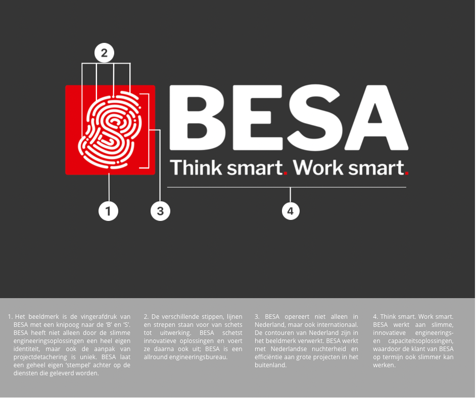
1. The logo is BESA’s fingerprint with a nod to the ‘B’ and ‘S’. BESA not only has its own identity due to the smart engineering solutions, but the approach to project secondment is also unique. BESA leaves its own ‘stamp’ on the services it provides.
2. The different dots, lines and stripes represent from sketch to elaboration. BESA outlines innovative solutions and then implements them; BESA is an all-round engineering agency.
3. BESA does not only operate in the Netherlands, but also internationally. The contours of the Netherlands have been incorporated into the logo. BESA works with Dutch sobriety and efficiency on large projects abroad.
4. Think smart. Work smart. BESA works on smart, innovative engineering and capacity solutions, which will also make BESA’s customers smarter in the long runcan work.
#BESA #ThinkSmartWorkSmart #VirtualEngineering #3dscanning #epcm #projectdetachering


